Project Introduction:
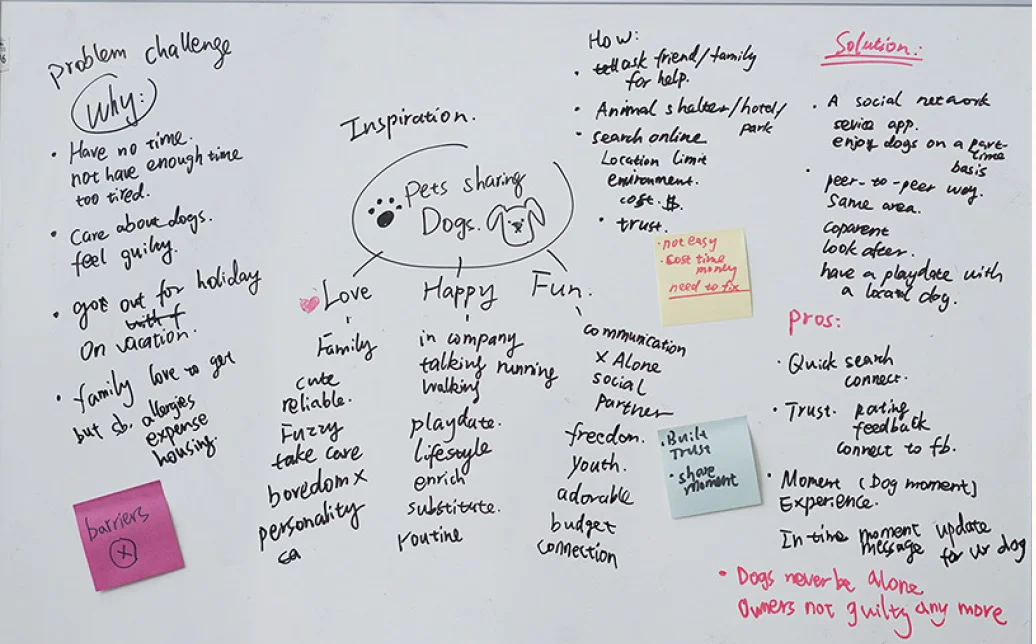
DOG LOVE SQUARED is a social network and service application that lets people enjoy dogs on a part-time basis. It is a peer-to-peer way for people in the same area to cooperate, look after, or just has a playmate with a local dog. Some people may feel guilty about leaving a dog at home while they’re at work. While others would love to get a dog, but can’t because of allergies, expenses, housing rules or travel schedules. DogLove Squared removes some of these barriers for people, and connects dogs with local people who want to spend time with them. DogLove Squared also gives dogs more walks, social time and love.
Duration: 8 weeks
Role: UX designer, Visual Product designer
Task: Interviews, Interaction Design, Visual Design, Prototyping, Usability Test, Project Management
Team: Vemmy Zhao, Jun Fan, Liv Browning, Chris Iverson, Paula Kopp
Result: High fidelity interactive prototype
Click here to download the process book
Click here to play live prototype
Process:
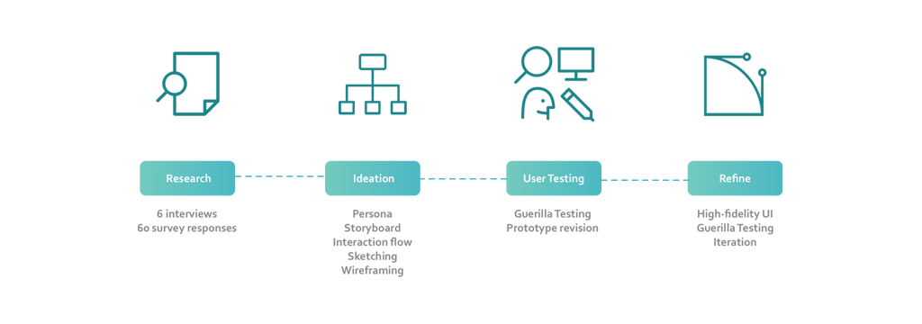
Over the course of 8 weeks, we helped pair up busy dog owners and qualified, trustworthy dog sitters in their neighborhood, to make dog-caring service more streamlined and accessible. Throughout the process, we actively engaged target user population by conducting user interviews in dog parks & dog lounges, online user surveys, and 2 rounds of usability testing to understand their needs and to inform design decisions.
Problem:
I joined an Apple workshop and the topic was “how to share more love for your dog”. Some people may feel guilty about leaving their dogs at home while they are at work. Other families would love to get a dog but can't because of allergies, expenses, housing rules or travel schedules.
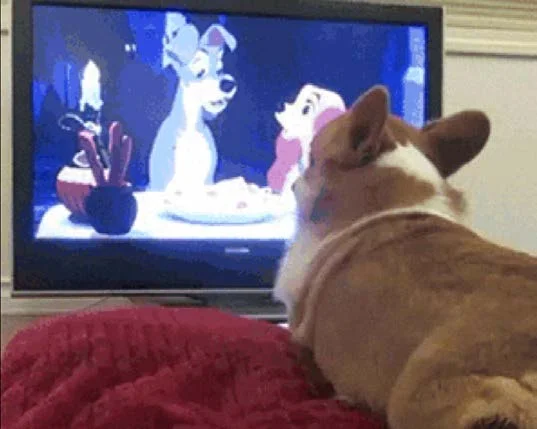
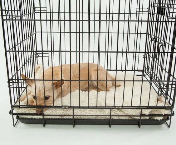
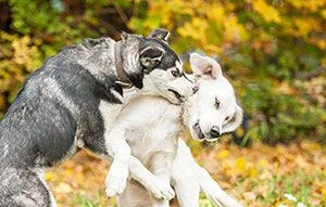
Have you thought about dogs’ feelings when you left them alone for more than 8 hours every day? You may think about dog kennel...but they may have other problems...
• health condition
• bully/fight
• taken good care?
"Why don't we build a solution from scratch?"
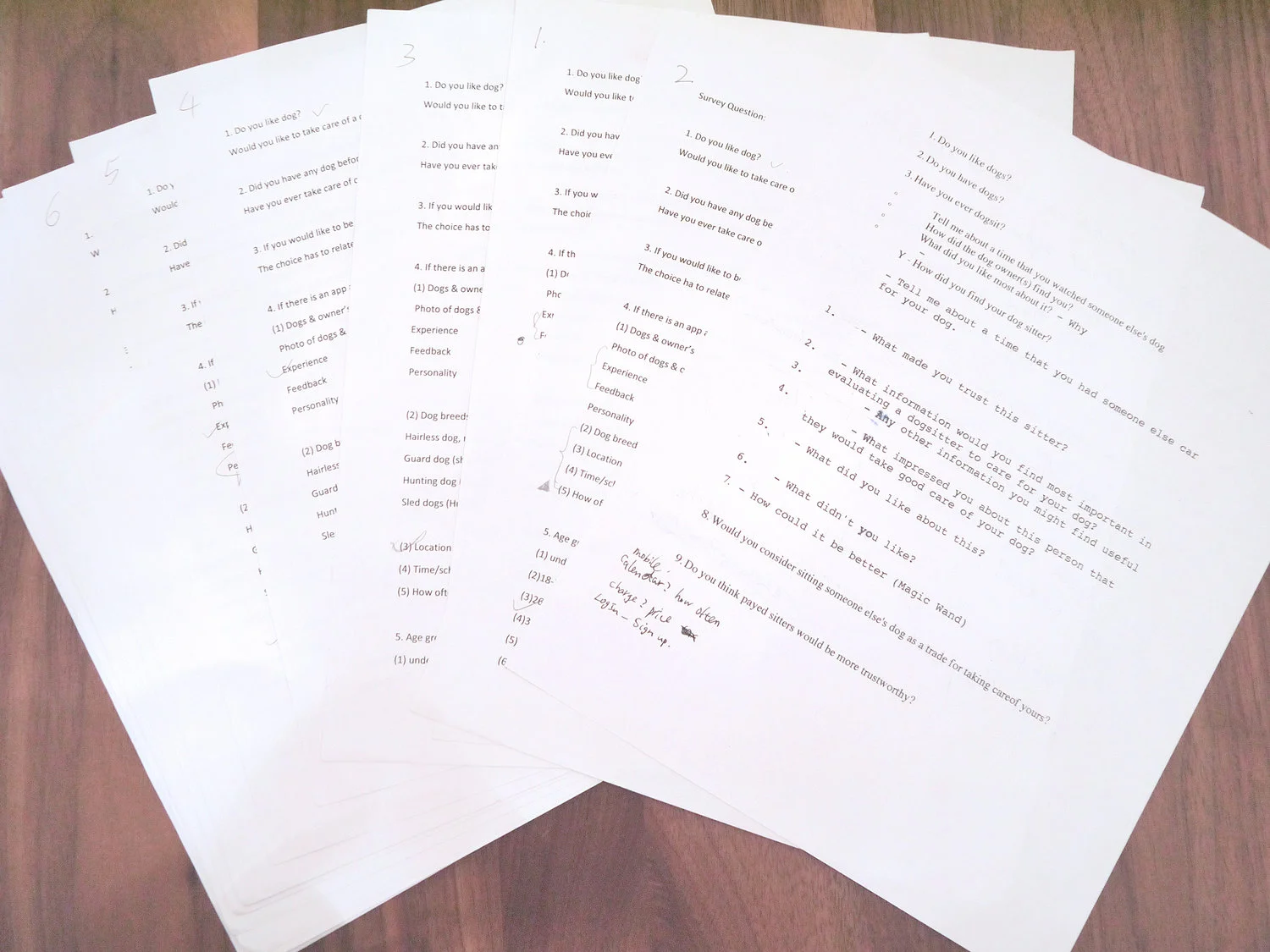
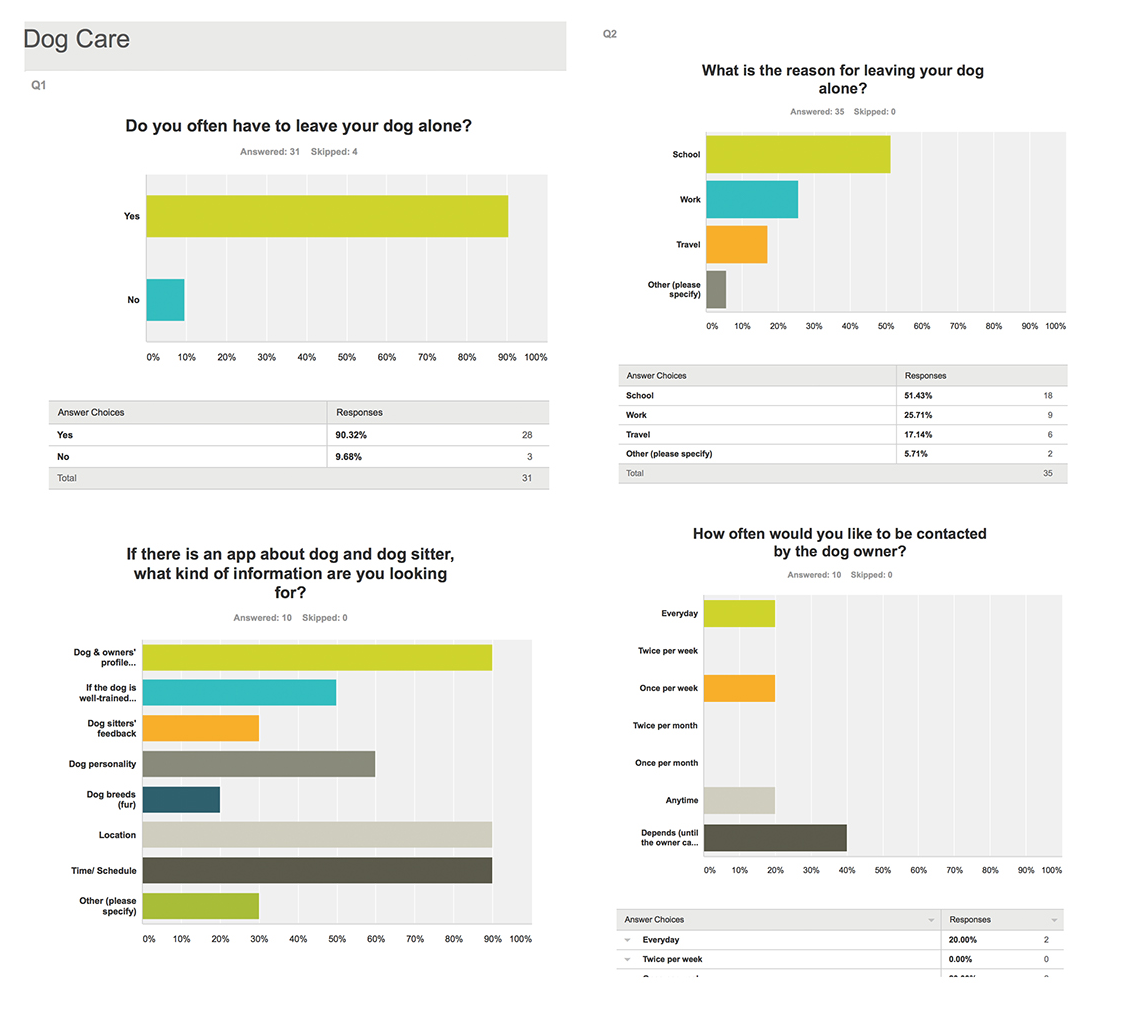
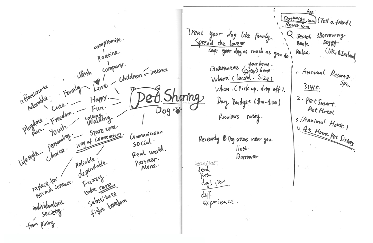
So we came up with this service app idea. In order to understand our target users and learn about the market, we conducted user research through questionnaire (35 responses online and 25 responses offline) and one-on-one interviews (6 dog owners and 2 dog sitters). Chick here to view the questionnaire on Survey Monkey.
So we came up with this service app idea. In order to understand our target users and learn about the market, we conducted user research through questionnaire (35 responses online and 25 responses offline) and one-on-one interviews (6 dog owners and 2 dog sitters). Chick here to view the questionnaire on Survey Monkey.
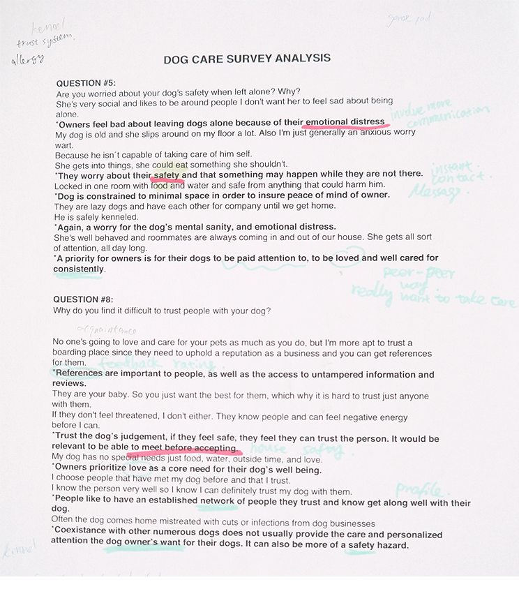
Key Findings:
• For dog owners, safety and health matters
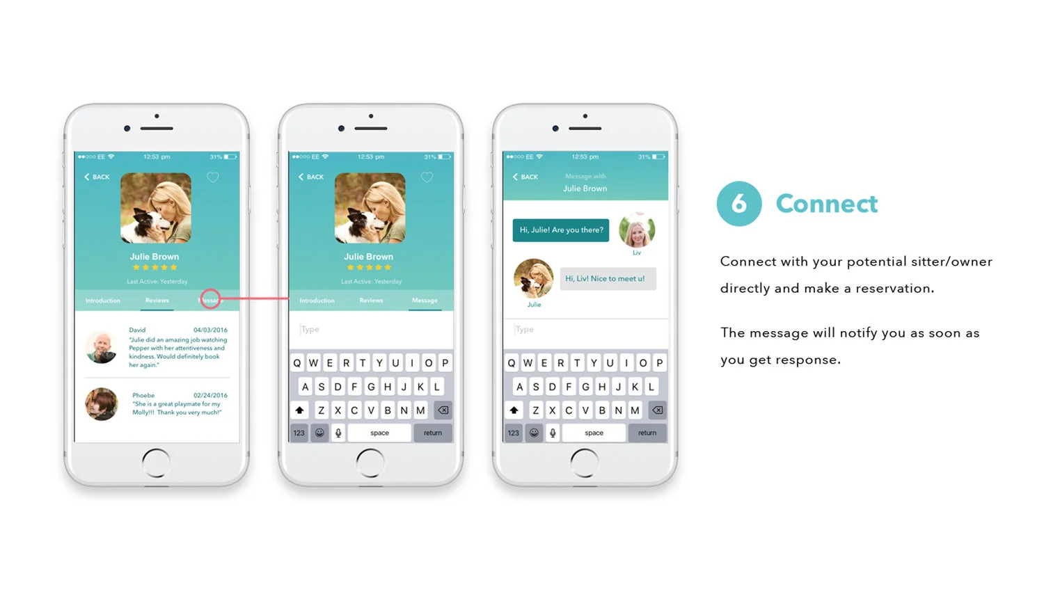
• They need to meet and have conversation with dog sitters
• They do have regular/occasional requirement with sitters
• Take dog size, rating, etc into consideration
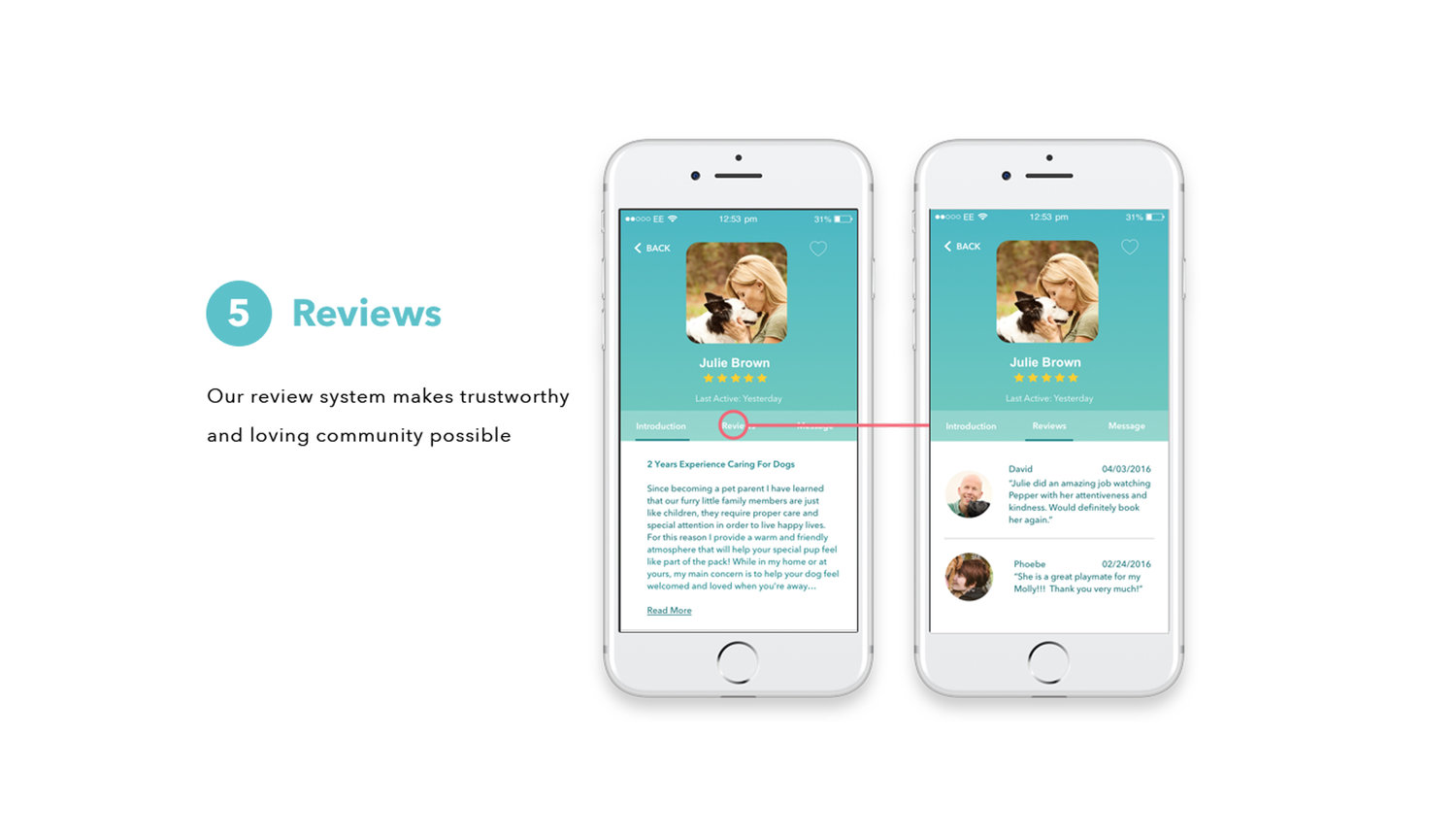
• Recommendation and reviews do help build trust
Personas & Storyboard:
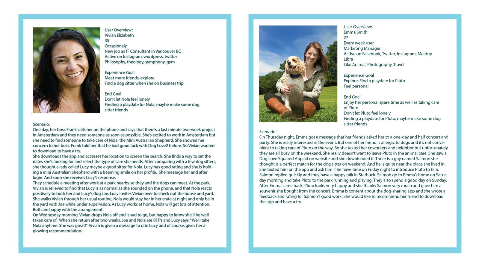
Taking into account all research findings, we envisioned a scenario of a busy professional who looks for a nearby dog-sitter to help her out when she has to be out of town. We quickly sketched out the personas, and mapped the plot into the following storyboard.
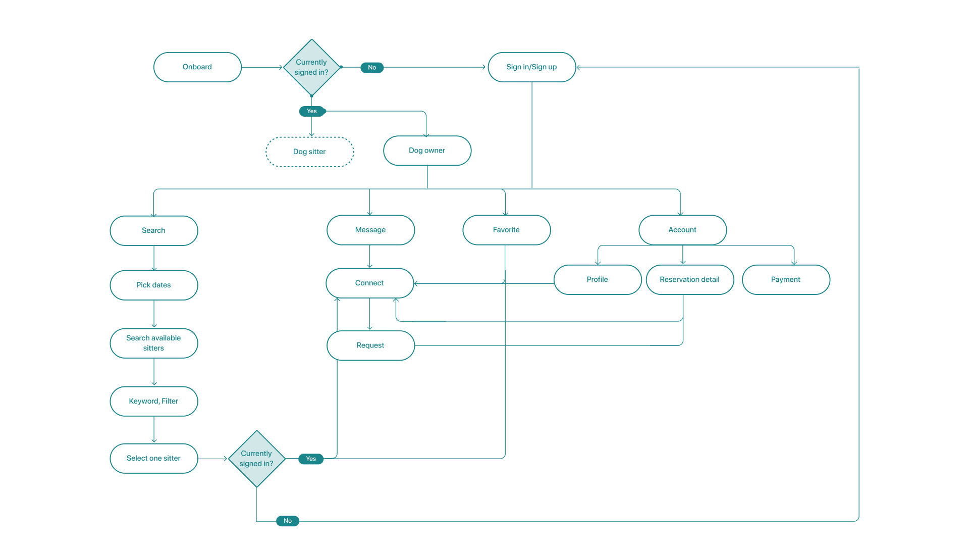
We then defined key features based on the user stories and previous research:
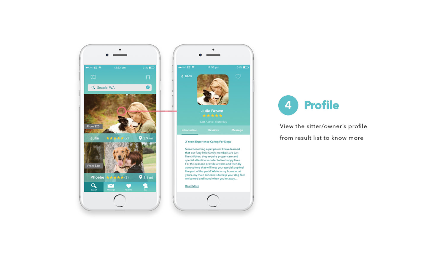
• Find dog owners/sitter in my neighborhood
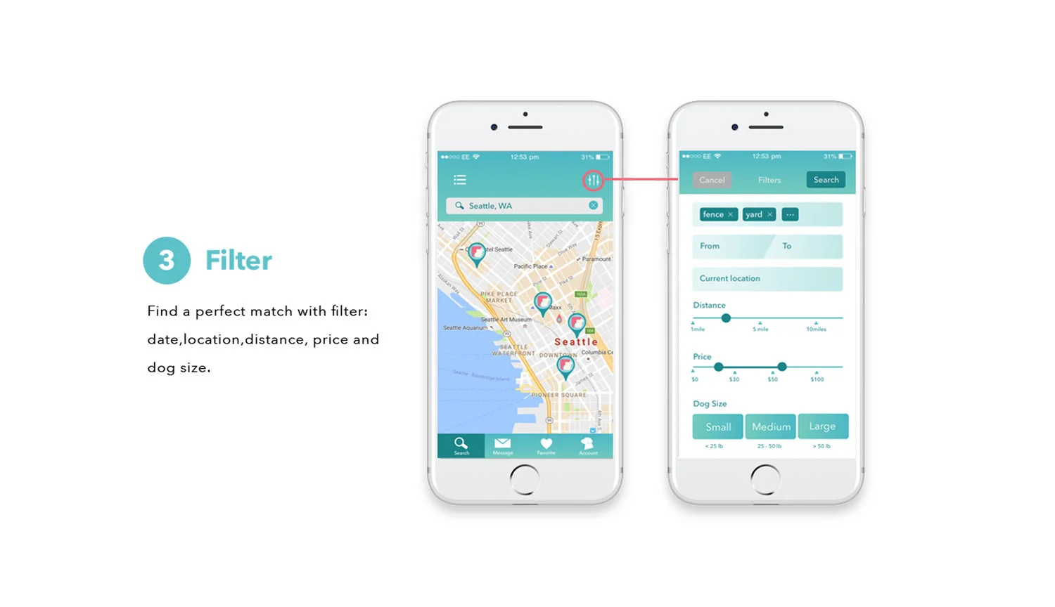
• Find a perfect match with filter
• Set up a profile with preferences
• Sync with my schedule
• For dog owners, meet the sitter in person before payment
• Review and rate pets and walkers
Ultimately, Dog Love Squared aims to build a safe, trustworthy, and loving pet-sharing community for dog lovers.
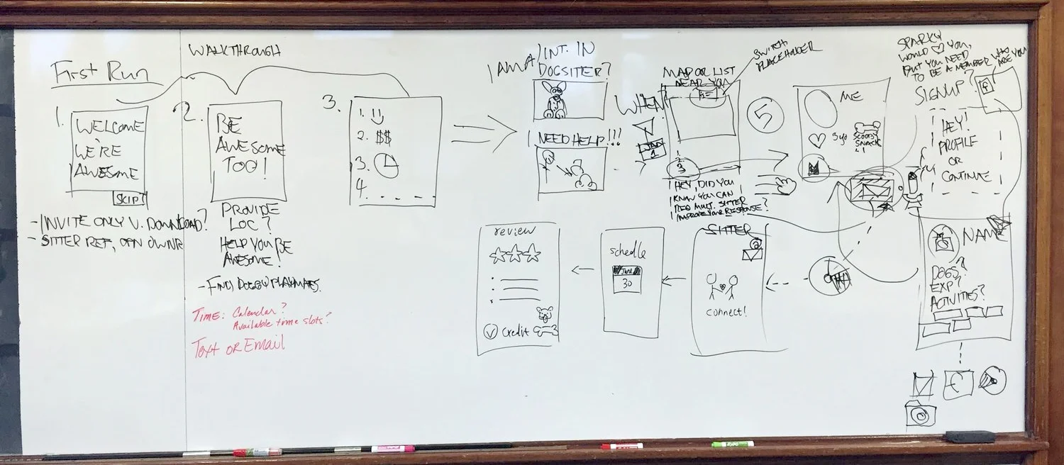
Wireframes: Click here to play with the wireframe
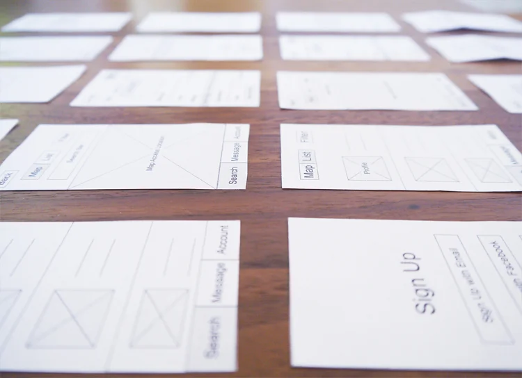
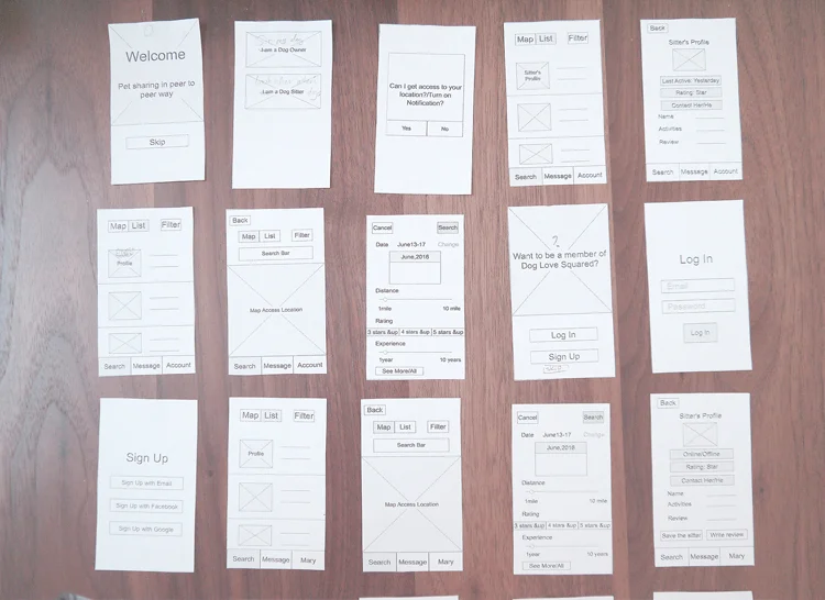
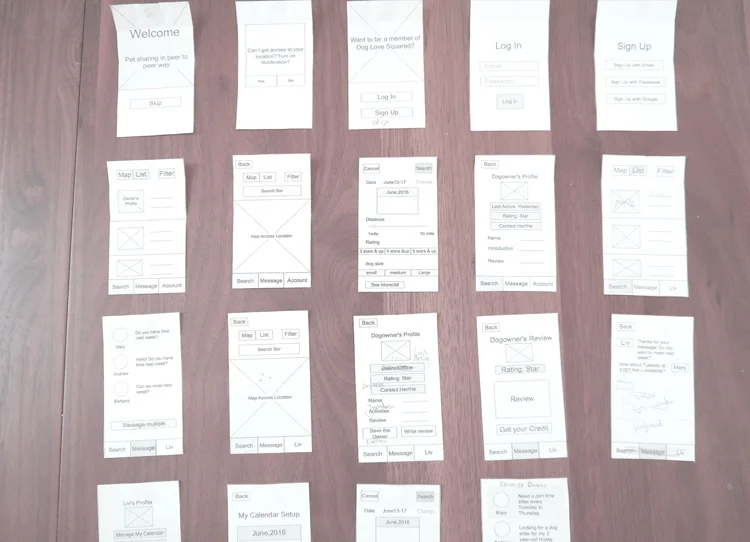
Paper Prototype:
Visual Explorations:
In determining the visual style of Dog Love Squared, we set out from collaging a mood board. Overall, we attempted to bring a clean, trustworthy, and delightful ambience to the experience. Thus, we embraced the calming and delightful teal blue first, and further nuanced it by adding a light green gradient to it, aiming to associate with liveliness of the platform.
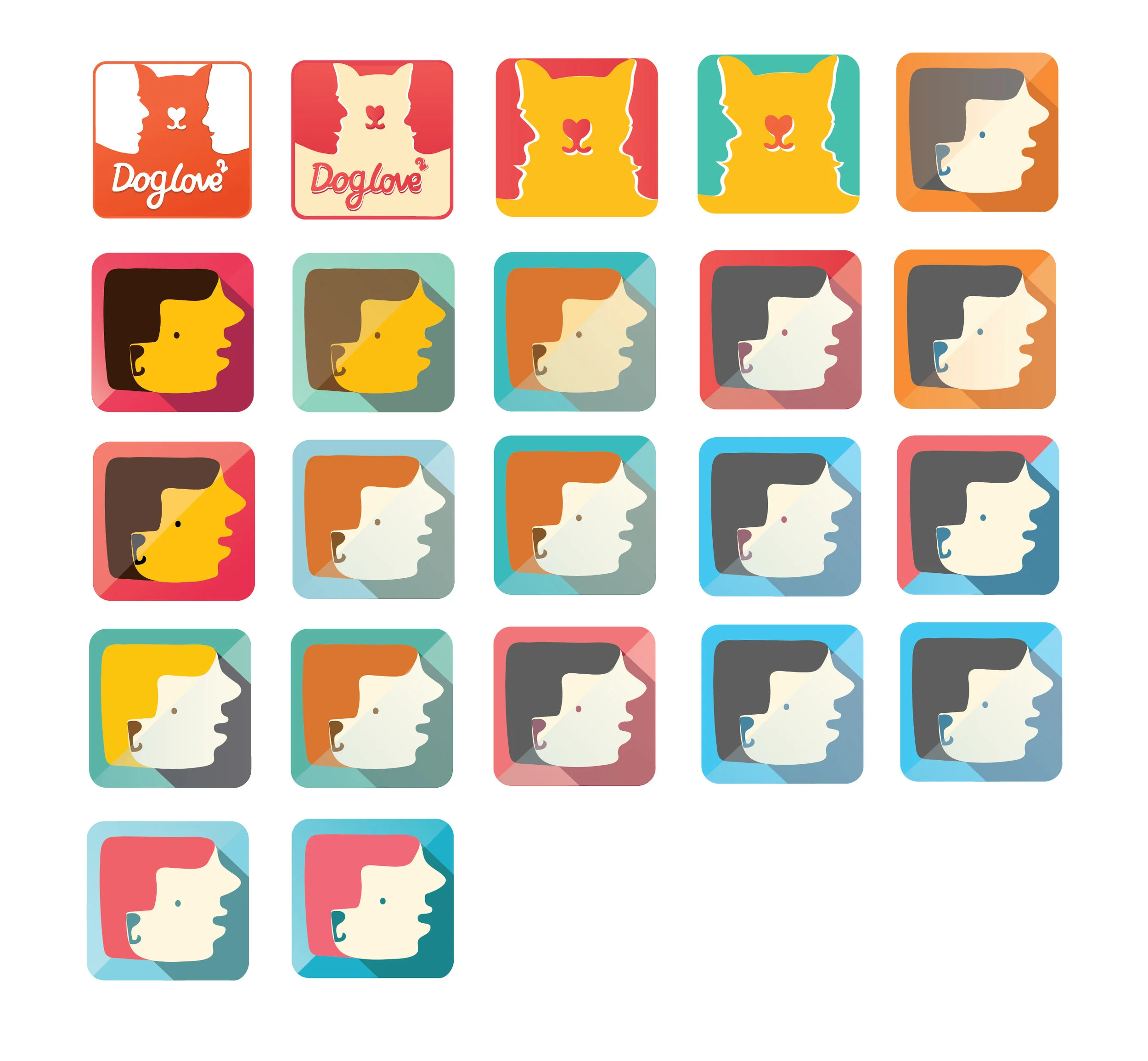
I created different graphics and color themes for the logo. Finally, I picked up the human and dog face since it is so unique and creative. I want to make good use of the positive and negative part of the shape. It brings harmonious and creates a good visual story. I used different color shade to enhance contrast.
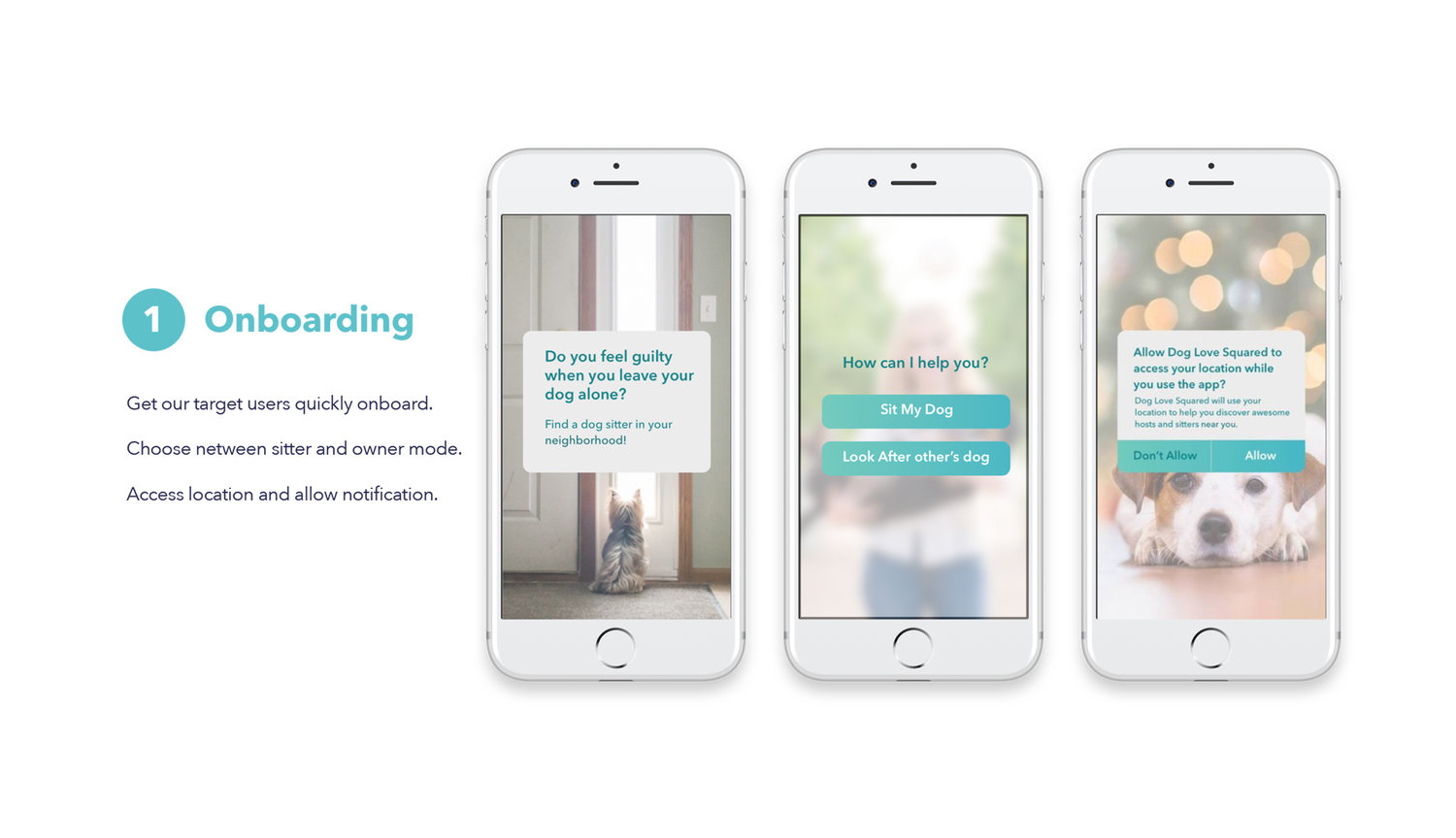
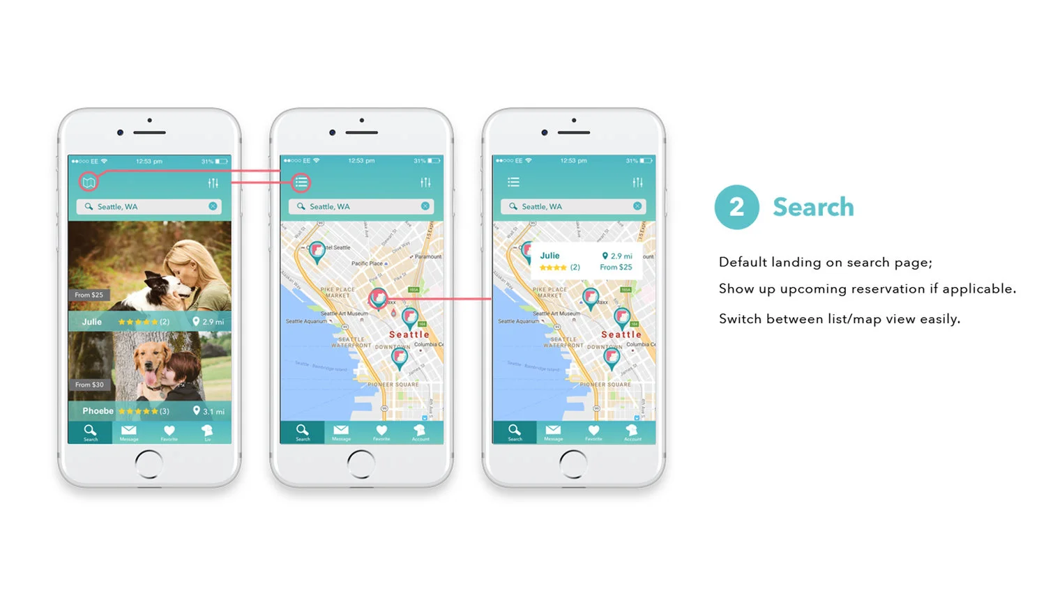
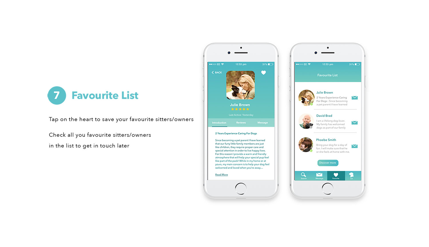
Product Walkthrough: Click here to play with live prototype
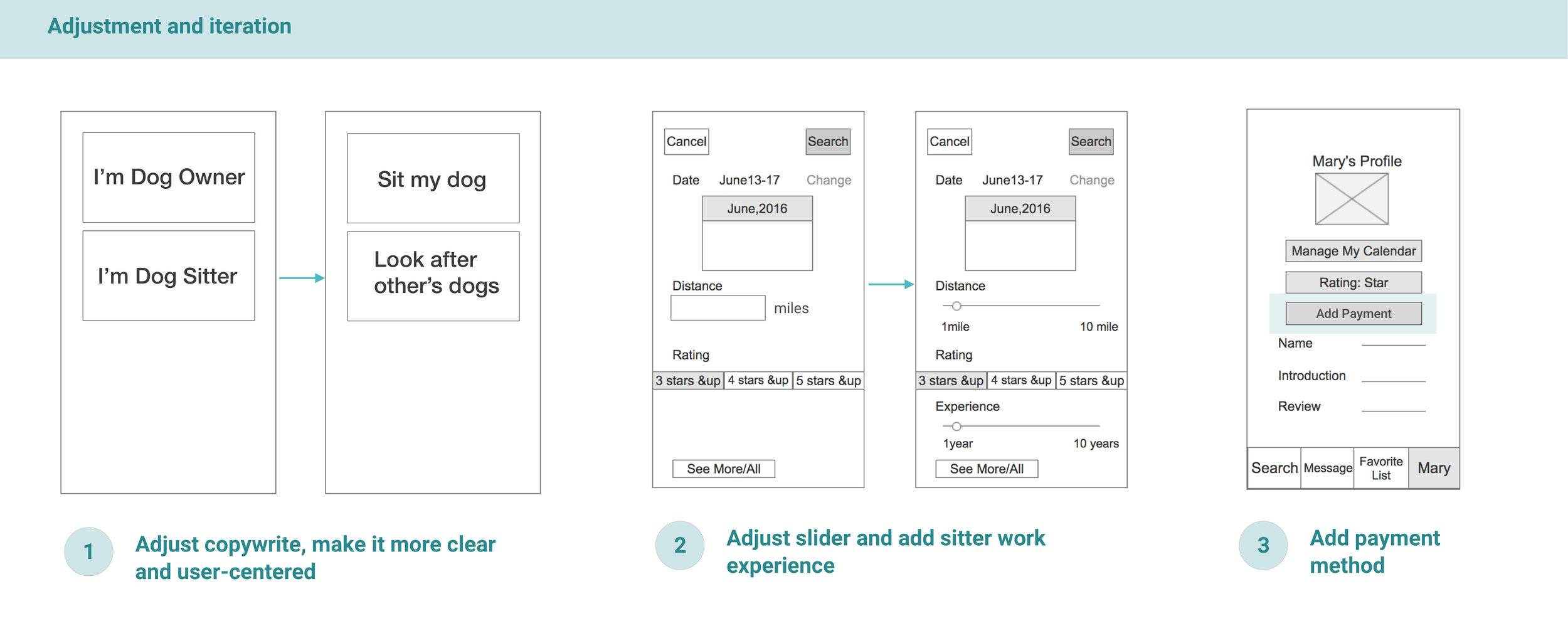
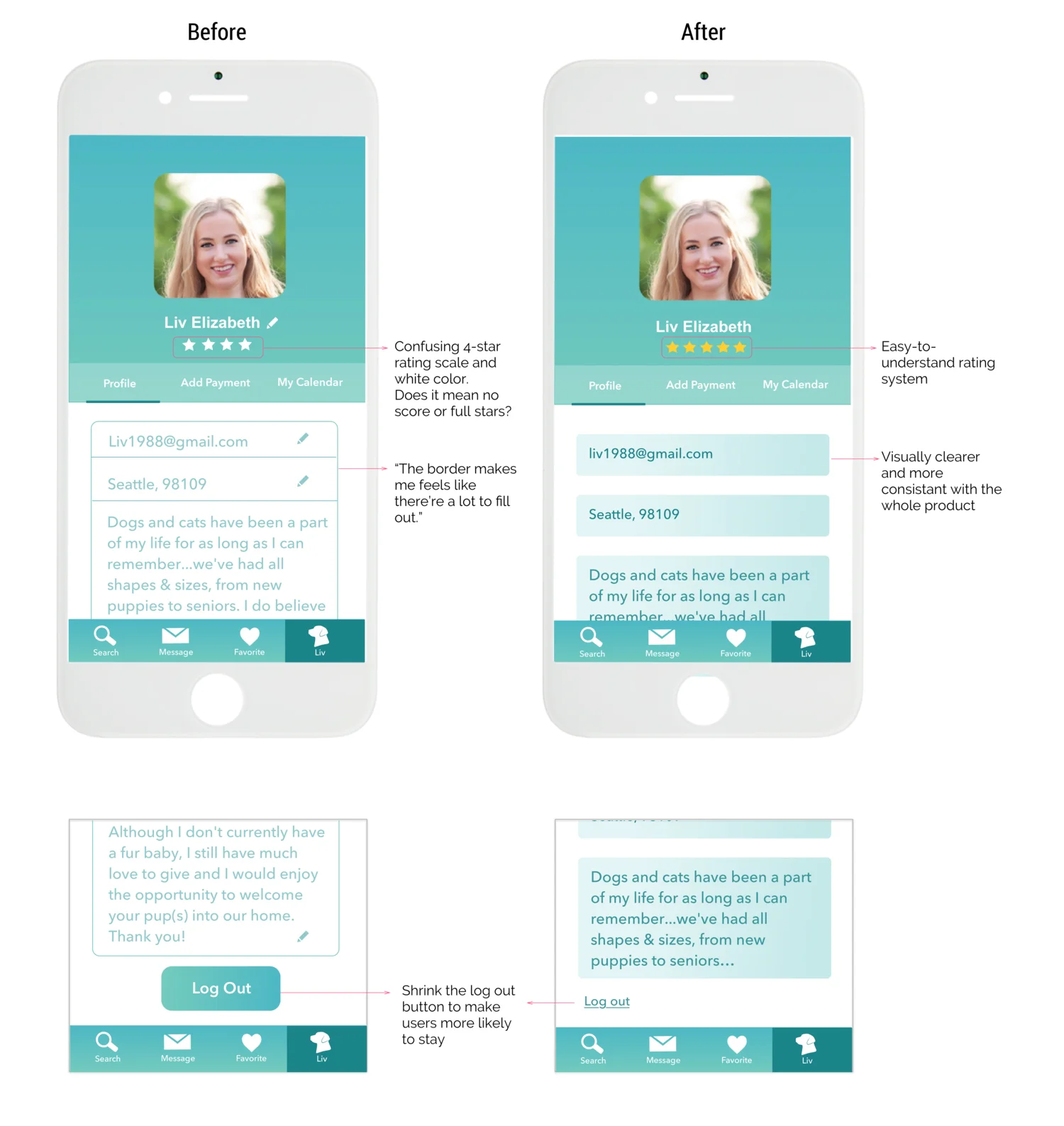
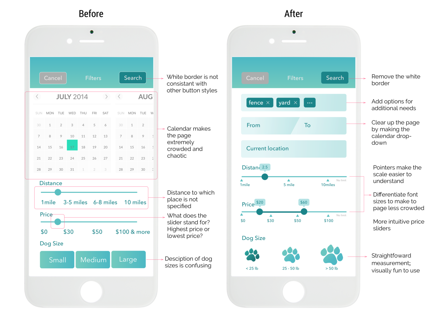
Iterations: Profile screen and filter screen
Takeaways : This was the first time I built a mobile app from zero. I am so happy to work with talented UX designers and researchers in my team. I also enjoyed the whole creative design process: defining the problem, doing user research, interview, and analysis. It had so much fun seeing so many cute dogs in a dog park and talking with owners about their concerns and requirements. There were too many possibilities at the very beginning, and I learned that we need to prioritize things to work on in order to deliver an MVP in the desired timeframe.
Things I would have done differently : When we finalizing the project, we found that Rover.com (also born in Seattle!), another dog-sitting/boarding service, has just made its debut successfully in the market. We could have dived deeper into the competitor analysis at the research stage, and differentiate ourselves at the beginning.
Future Directions : So far, we still need to refine the visual and interactions and test with our users. From the business perspective, we really need to differentiate ourselves by going for a niche market. (maybe a community-enhanced business model or social networking driven app, maybe dog Airbnb)
